
Pick three to five colors: a dominant, a secondary, an accent, a neutral and a metallic. Split them roughly 60-30-10, so one color leads and the others support.
Then do the part almost every guide skips. Check that the flowers in those colors actually exist in your wedding month.
And get the print values before anything goes to a stationer. A palette is not a mood board. It’s a purchase order.
There’s no shortage of articles listing beautiful 2026 palettes. Mocha and champagne. Sage and ivory. Terracotta and olive. They’re genuinely nice combinations, and any of them would look lovely.
Almost none of them tell you whether your florist can buy those colors on your date. Or what happens to them when they hit paper.
Start with the structure, not the swatches
Most designers work with five slots rather than a loose collection of favorites:
| Slot | Share | Where it shows up |
|---|---|---|
| Dominant | 60% | Linens, bridesmaid dresses, the bulk of the florals |
| Secondary | 30% | Supporting flowers, ribbon, signage |
| Accent | 10% | The one color people notice. Napkins, stationery detail |
| Neutral | Underneath everything | Ivory, cream, oat. The thing that stops it shouting |
| Metallic | Small touches | Gold, silver, copper. Candlesticks, flatware, foil |
Three to five colors is the usual advice, and it holds up. Fewer than three tends to look underdressed. More than five stops reading as a decision.
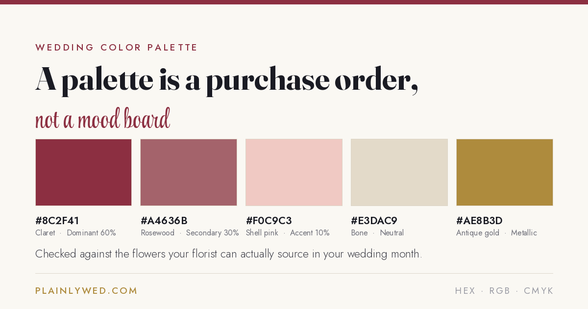
Claret, rosewood, shell pink, bone, antique gold. Dominant, secondary, accent, neutral, metallic.
The question nobody asks until it is too late
This conversation happens in a lot of florist meetings.
A couple arrives with a blush palette built around peonies. Their wedding is in October. Peonies bloom for six to eight weeks. Late April to early June, with May at peak.
Imports appear from October through January at two to three times the price. Fewer colors, and usually smaller.
Dahlias have a similar problem in a different shape. They peak July through October. Outside that window they’re hard and expensive to source, and quality falls off sharply.
A few warm-climate growers stretch into November. But a February dahlia is not a plan.
| Flower | When you can actually get it |
|---|---|
| Peony | Late April to early June |
| Ranunculus | December to April |
| Tulip, sweet pea, lilac | Spring |
| Garden rose, hydrangea, lisianthus | Summer into early fall |
| Dahlia | July to October, poor outside it |
| Chrysanthemum, marigold, celosia | Fall |
| Anemone, amaryllis, waxflower | Winter |
| Rose, eucalyptus, olive branch | Every month of the year |
Seasons above are for the United States and reflect domestic availability. A florist in a warm region may stretch a season by a few weeks, and most flowers can be imported at a premium. Confirm with yours before committing a palette to print.
None of this means you can’t have a blush October wedding.
It means the blush comes from garden roses, ranunculus or dinner-plate dahlias instead. And you find that out now, not in a meeting.
The money matters too. Flowers in season cost roughly 30 to 50 percent less. That’s compared with the same variety shipped in against the calendar.
Match your palette to your month. It’s one of the few decisions that makes a wedding cheaper and better.
Our wedding color palette generator builds a five-color palette. Then it tells you which flowers come in those colors in your wedding month.
It flags the ones that don’t, and names a swap for each. You also get the hex, RGB and CMYK values on one printable page. Free, no sign-up.
Your screen is lying to your printer
Hex and RGB describe light. Your screen emits it. CMYK describes ink, which a printer lays down on paper. They’re different physical systems. They can’t match perfectly.
A saturated color that glows on a monitor will usually sit duller on cotton card stock.
That’s not a printing error. It’s physics. And it catches couples out at exactly the wrong moment.
- Give every vendor the same codes. Hex for anything on a screen, CMYK for anything printed. Most color mismatches between stationery and linens come from three suppliers each interpreting the word “blush” differently.
- Always order a printed proof. Paper stock, ink and finish all shift the result. Approve a run from a screen and your invitations end up a shade off from everything else.
- Check your signage contrast. Are two palette colors close in tone? A seating sign printed in one on the other goes unreadable at a distance in low light. Which is exactly when people read it.
Let the venue vote
A venue arrives with colors already fixed: the carpet, the wood, the walls, the garden. A palette chosen on Pinterest in isolation can fight all of it.
Photograph the room in the light your wedding will be in. Then build around what’s already there.
A barn with warm wood suits terracotta, sage and burgundy. A white-walled ballroom will take almost anything.
Covering a carpet you dislike costs far more than choosing colors that live alongside it.
A sequence that works
- Season first. It sets what your florist can buy and what the light will do.
- Then the venue. Work with the fixed colors, not against them.
- Then your five slots. Dominant, secondary, accent, neutral, metallic.
- Then check the flowers against your actual month.
- Then get the codes and hand the same sheet to every vendor.
- Then proof it in print before approving anything.
Common questions
How many colors should a wedding have?
Three to five. The usual structure is a dominant color, a secondary, an accent, a neutral and a metallic. Split them roughly 60-30-10, with the neutral and metallic holding it together.
Fewer than three reads as underdressed. More than five stops looking deliberate.
Can I have peonies at a fall wedding?
Not domestically. Peonies bloom for six to eight weeks, late April to early June, with May at peak.
Imports from Chile and New Zealand appear October through January at two to three times the price. Fewer colors, and often smaller heads.
The usual swaps are garden roses, particularly Juliet, Keira and Patience. Or dinner-plate dahlias, which peak in September and October. They give similar scale and fullness.
Should I pick colors before or after the venue?
After, if you can. Venues come with fixed colors in the flooring, walls and landscape. A palette chosen in isolation can clash with all of it.
Photograph the space in the light your wedding will be in. Then build around what’s already there.
Why do my printed invitations look different from my screen?
Because screens emit light and printers lay down ink. Hex and RGB describe one, CMYK the other. They can’t match exactly.
Expect printed colors to sit slightly duller than they looked on a monitor.
Order a physical proof before approving a full run. Give your stationer CMYK values, not a hex code.
Do wedding colors have to match the season?
Not for aesthetic reasons. Plenty of couples do beautiful winter weddings in blush and summer weddings in burgundy.
They have to match the season for practical ones. Your florist buys what’s growing. Working against the calendar costs 30 to 50 percent more, when it’s possible at all.
The short version
Choose five colors in five roles. Check them against the venue, and against what your florist can buy in your month.
Then hand every vendor the same hex and CMYK values. Proof it on paper before you approve anything.
Do that and the palette on your screen is the palette in the room.
Read next
- Wedding color palette generatorBuild the palette, then check the flowers are actually in season in your wedding month.
- How much does a 100 person wedding cost in 2026?Where flowers sit in a real 100-guest budget, and what they displace.